
By Julie Neuman, Sandbox Creative Group
In a world full of colour, have you ever wondered why logos are becoming simpler and often all white? I have been reading about the various ways people perceive colours, and I believe this is one of the reasons why designs are evolving to a more minimalist approach.
During my time working in retail when I was younger, I frequently encountered customers asking me, “Does this match or does this look good with this?” Some would admit to being colour blind, while others would mention their struggles with matching colours. I was genuinely surprised at how frequently people would tell me they were colour blind. Whether they were or not, I would often assist them in pairing shirts and ties or other clothing items.
Having experienced this, it made me wonder how different people perceive colour in design.
First, I delved into researching the most common type of colour blindness, Red-green colour blindness (also known as deuteranopia or protanopia). Individuals with this type have difficulty distinguishing between red and green, often perceiving them as shades of gray or brown. Imagine how dull Christmas must look to them!
The less prevalent type is Blue-yellow colour blindness (also known as tritanopia), which makes it challenging for individuals to distinguish between blue and yellow. They tend to see these colours as different shades of gray.
So, what colours would be best for everyone to perceive? It is recommended to utilize shades of orange or blue as their popularity and colourblind-friendly properties make them suitable choices.
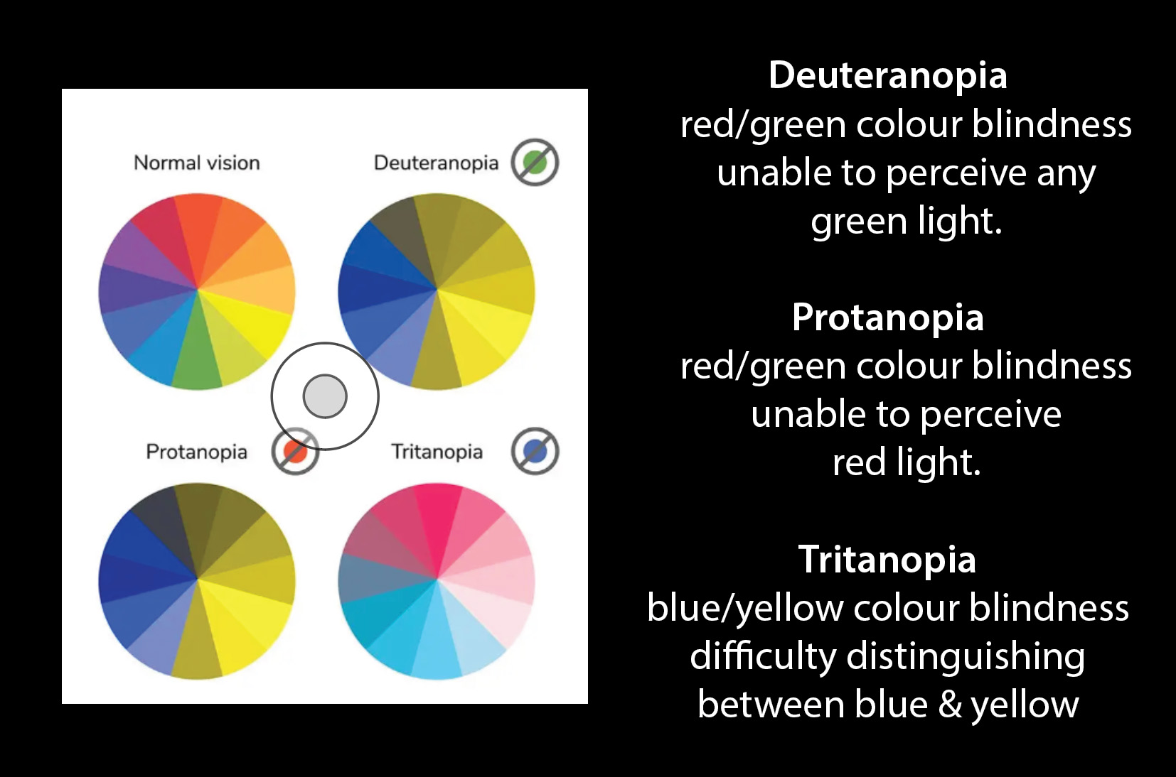

Click on images for larger view
Adobe Color (https://color.adobe.com) now offers colourblind-friendly palettes that allow designers to be more considerate of these issues. (See sample above)
Even with the knowledge that orange or blue are the most suitable choices, the chart above demonstrates that these colours will still appear different to different individuals. To ensure better visibility and readability of your design, it is important to consider contrast, texture, shape, and spacing in addition to colour choice.
Therefore, it is always good practice to initially design logos in black and white before adding colour later. So lets always keep in mind, we all view the world in different colours.